seek - The Exploring App
The app that encourages users to explore different things in their city and make friends along the way.
PROJECT TYPE
Independent
TEAM
Myself
MY ROLE
UX Designer
TOOLS
Figma
DURATION
10 weeks
DATE
May - July 2024
Problem
London is one of the most culturally rich cities and with a melting pot of cuisines, languages, ethnicities and traditions.
However, many young adults living in London struggle to find out what is happening in their neighbourhood or places that they frequent.
Solution
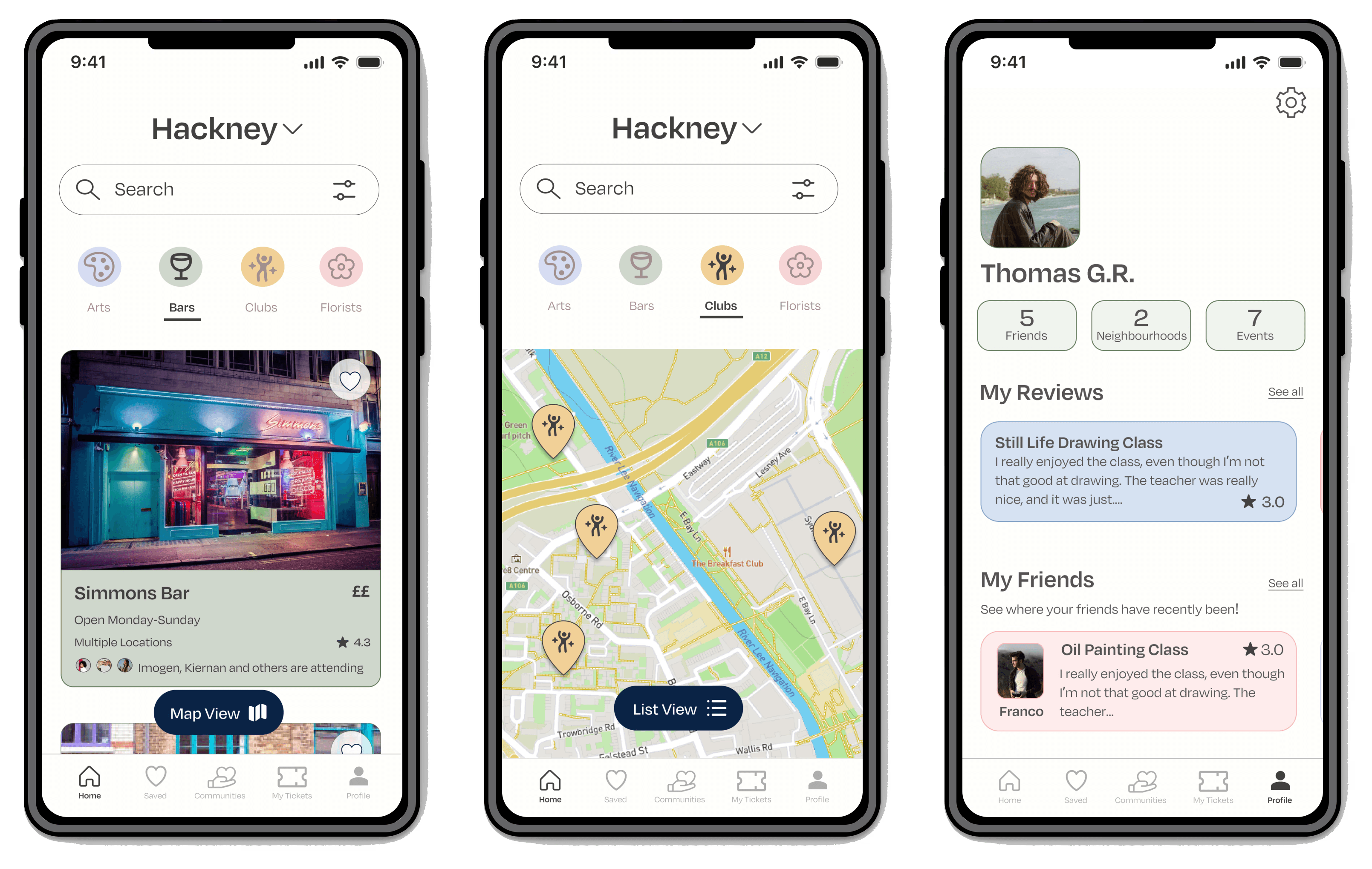
I developed an application that enables individuals to look for things to do in their area that align with their interests - and save them in an easy and accessible way.
This allows for easy searching and users are also able to see reviews from others.



Background
To begin investigating the problem space, I turned towards existing quantitative research. I wanted to find research on different aspects of the issue, but specifically the relationship between media and community.
I found that:
64% of adults use 3 different types of media to get informed about their local community
76% of internet users participate in an online community
60% of businesses own an online branded community
From my findings, it was clear that users are searching for community, however the opportunity for intervention lies in process of finding one.
User Interviews
Digging deeper - what do London citizens think?
Key themes
After doing my secondary research, I conducted some user interviews. I chose user interviews in order to gain a deeper understanding of the problem space and verify the validity of my assumptions.
Participant criteria:
Participants should be living in the UK
Participants should like trying new things in their area
Participants should use apps in order to search for things to explore
Must be a young adult (18+)
I used an affinity map to help me identify the key themes from my interviews. Three main themes emerged:
My user interviews outlined that users like to do research for specific things, but find the process tedious and time consuming - however, they are looking for detailed information, reassurance from others, and an easy way of going to look back at what they’ve found to make the process easier.
HMW Question
How might we?
How might we empower young adults to easily discover and stay informed about local cultural events and activities in their city while addressing the time-consuming nature of multi-platform research?
Persona &
Experience map
Who am I designing for?
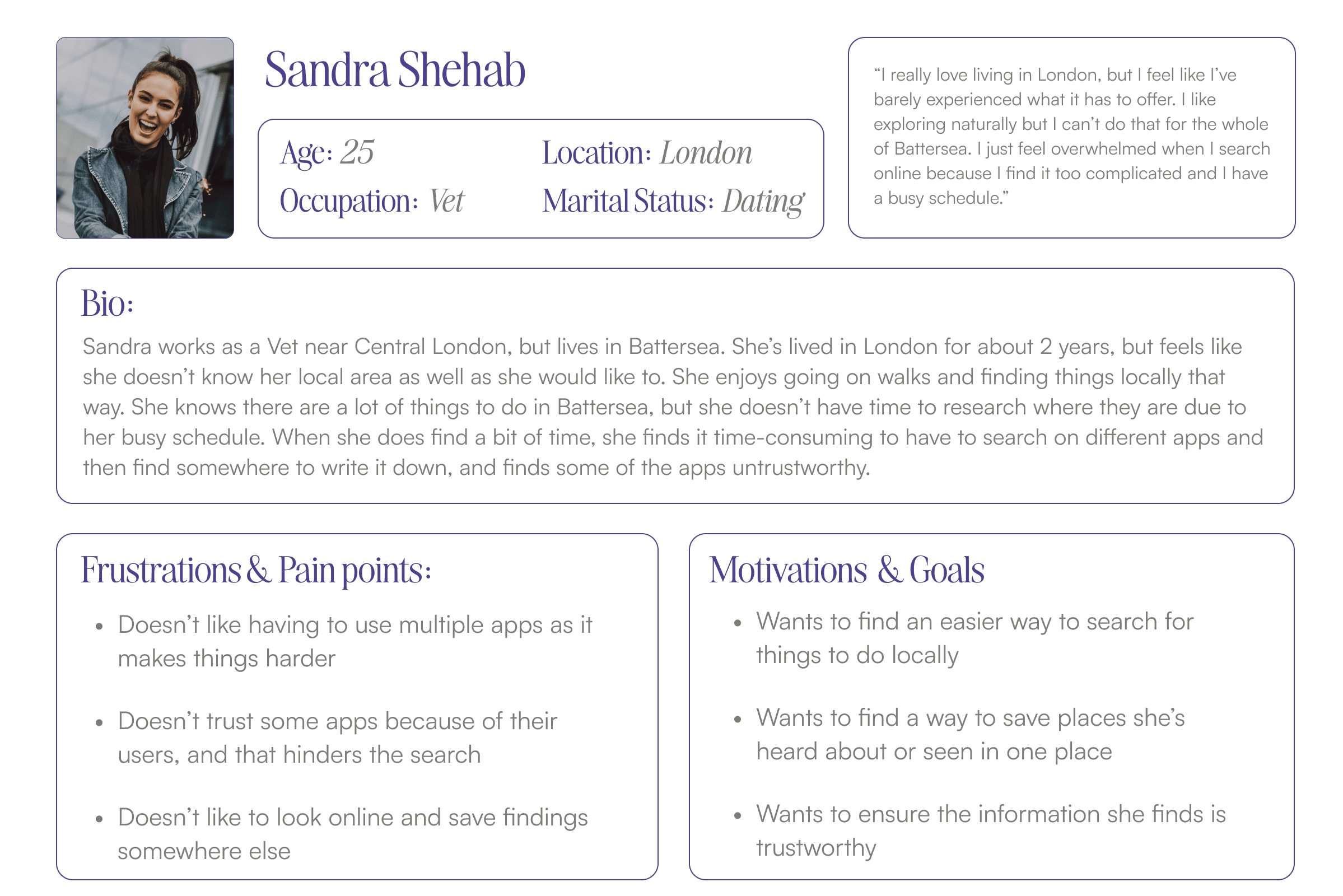
I was able combine all of my findings into a persona that represents the core insights of my target users.
Experience Map
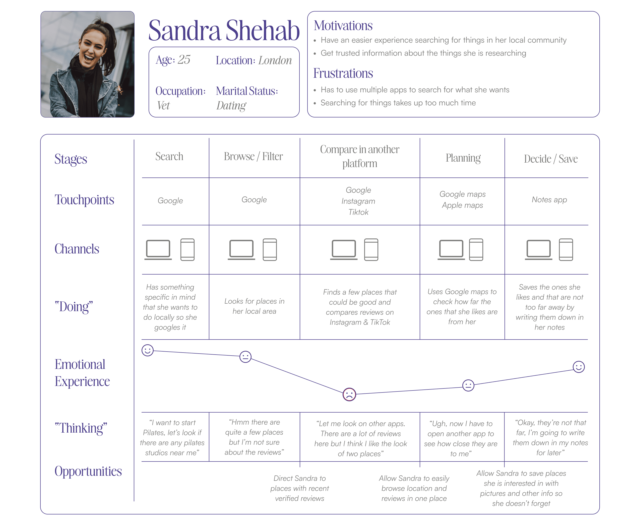
To gain a deeper understanding of my users needs I developed an experience map to identify the current state of searching for something to do locally.
This helped me further understand user expectation, behaviours, pain points and challenges and insights into spaces of opportunity.
Finding a way to empower user to explore where they live, save
things they like, and meet people - all in one place
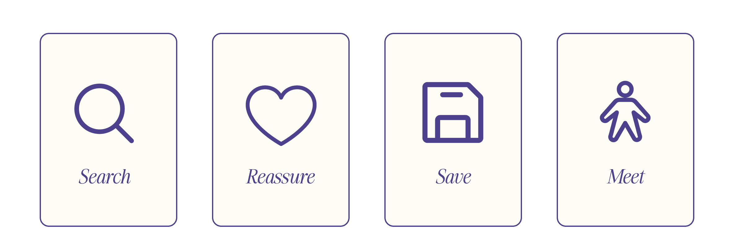
I brainstormed some ideas using the “Crazy 8” method, as well as some during some collaboration sessions with my peers, I narrowed down my solution to four main functions:
Task Selection
To gain a deeper understanding of my users goals and motivations, I authored a set of user stories. After this, I grouped them into 4 epics, and then chose the epics that I thought would be high in user value to develop into task flows. I settled on:
Finding an event and purchasing a ticket
Leaving a review for something
Primary Task Flow
As a London resident, I want to find something that aligns with my interests in my area so that I can try something new.

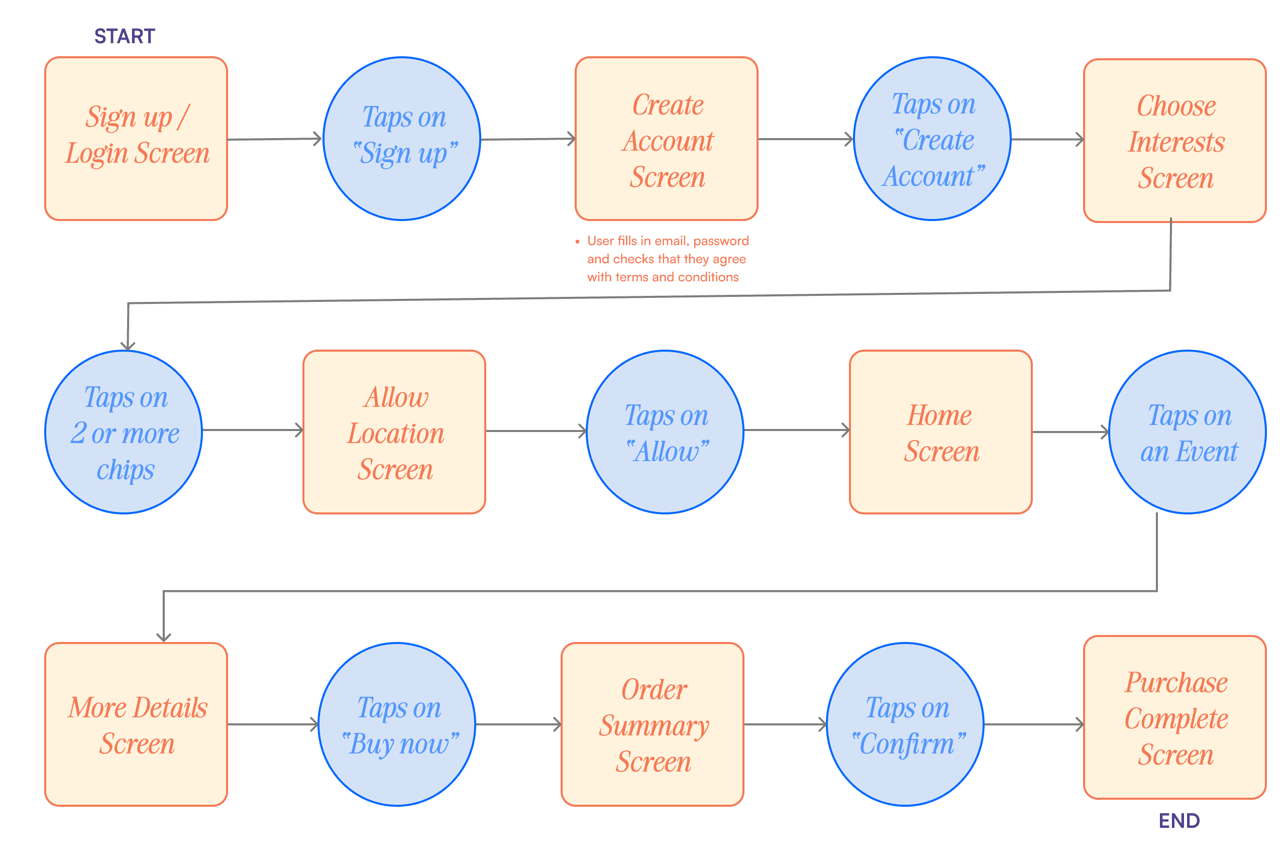
Task flow explained: Sandra is new to the app so she completes the short onboarding process so that she can get personalised content. She finds an event she wants to go to, reads the description and decides to purchase a ticket within the app.
Secondary Task Flow
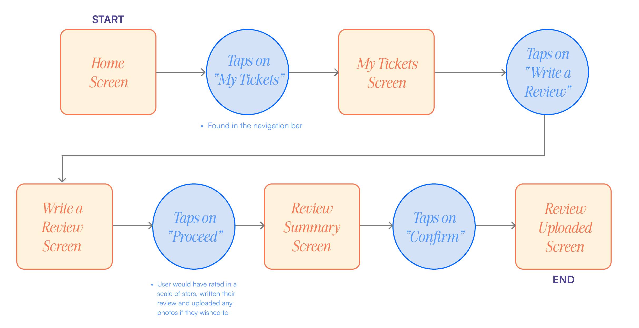
As a London resident, I want to leave a review for something I’ve been to so that I can help others make informed decisions.

Task flow explained: Sandra has attended the event that the app recommended for her, and when she goes to her tickets tab, she is prompted to leave a review. She decides to write how much she enjoyed the event and uploads her review.
Develop
After this, it was time to start visualising how all of this would look
on a mobile screen - starting with sketches!
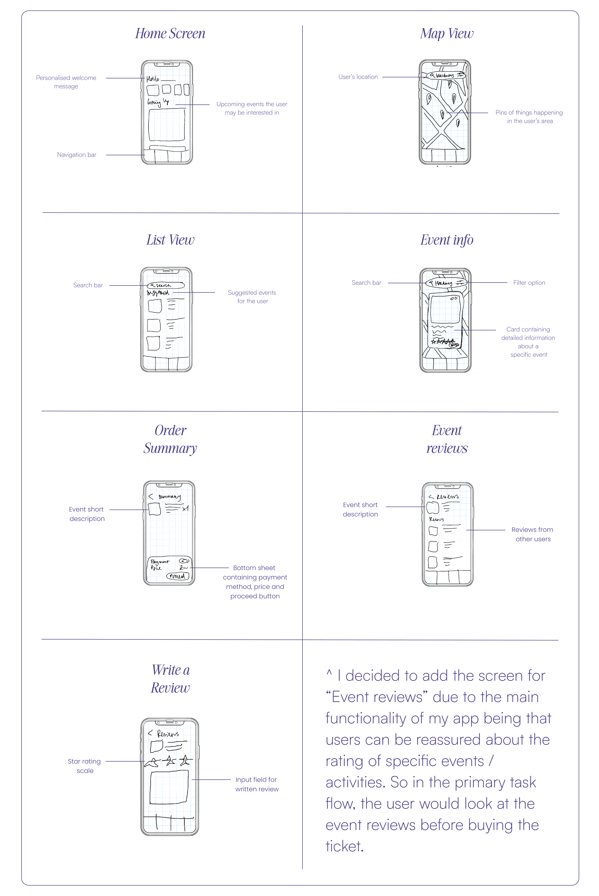
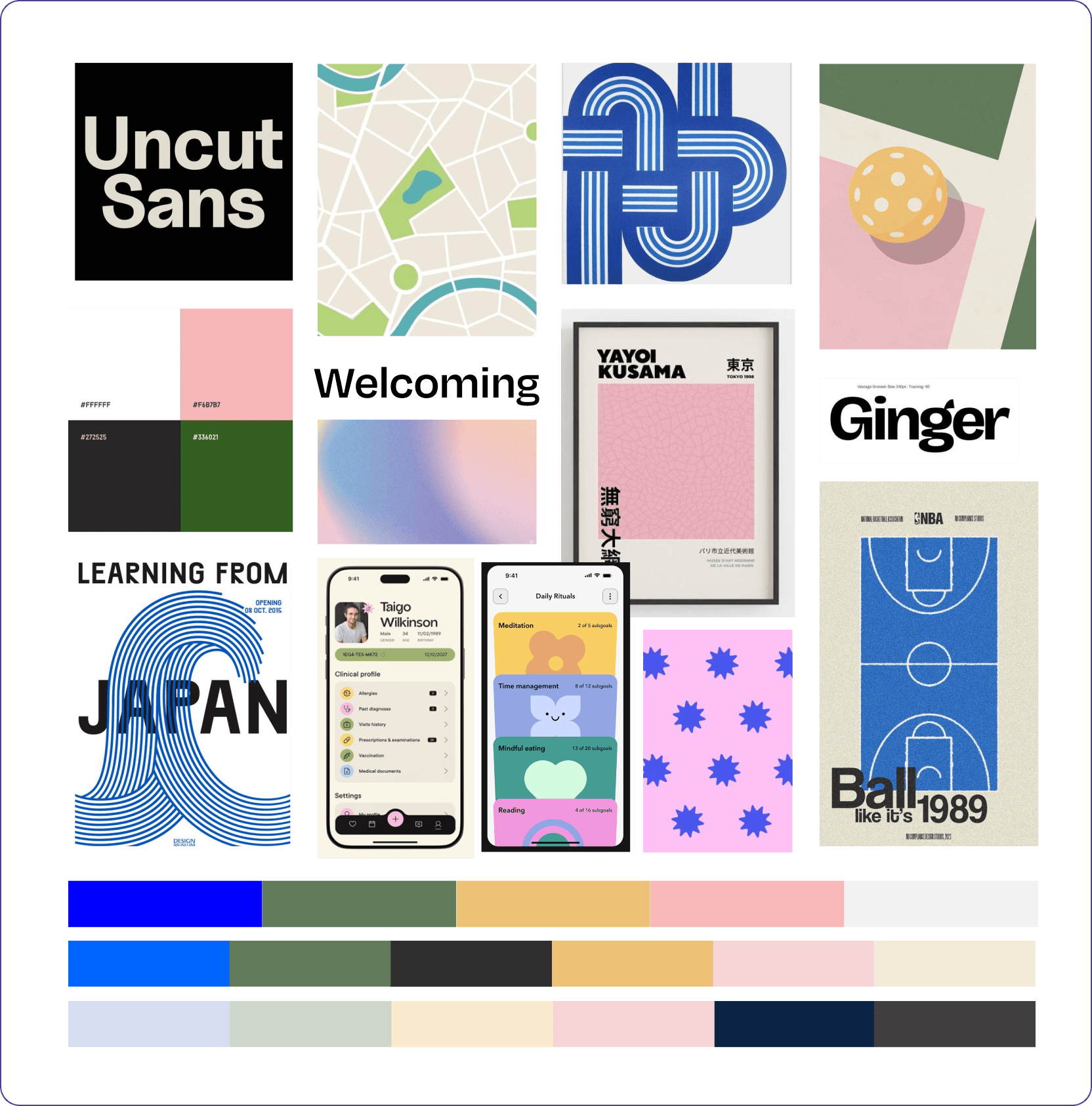
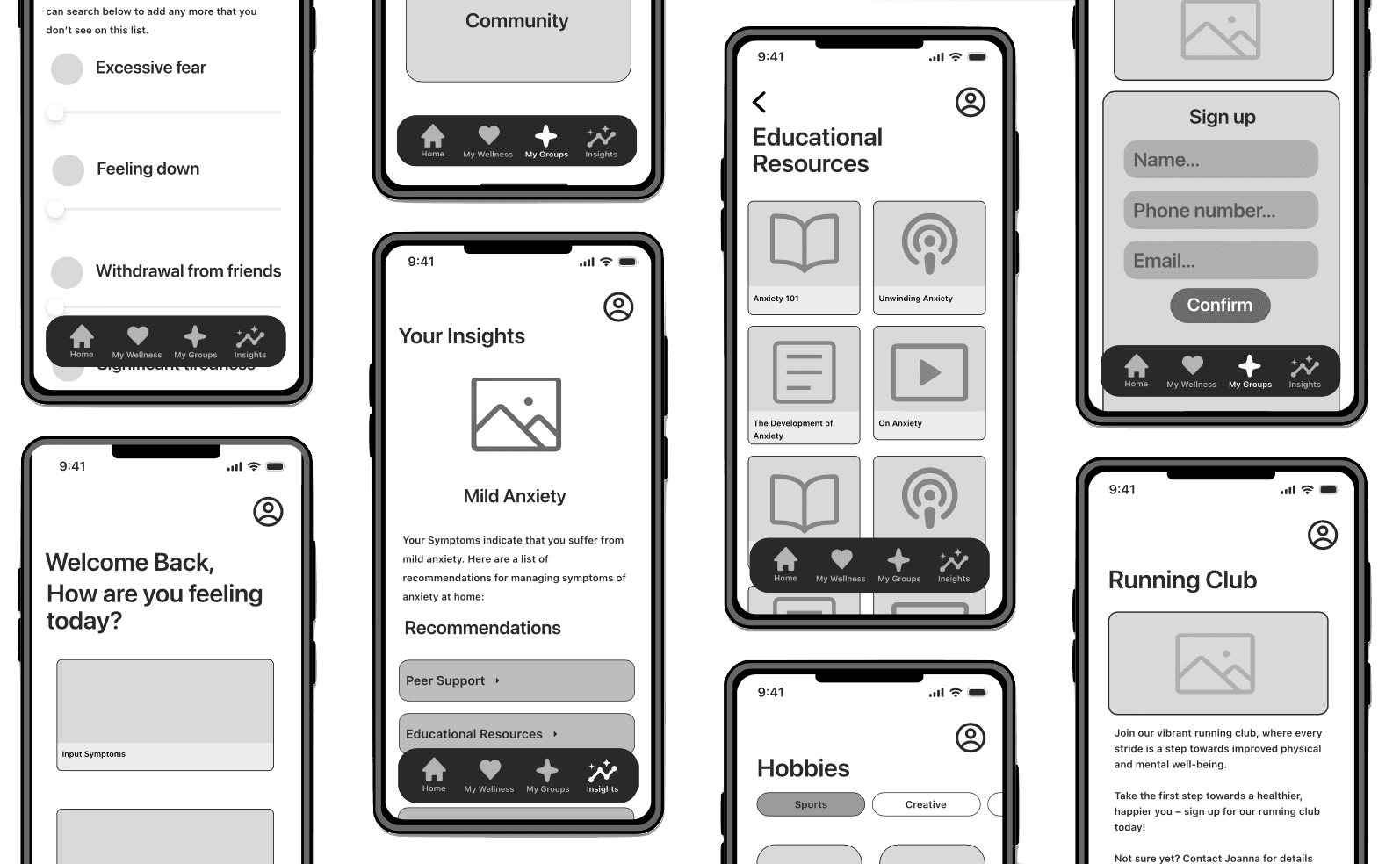
Before starting to sketch, I created a UI inspiration board to inform the features and functionality of my solution. After this, I created some sketches of the screens that I would need for my primary and secondary task flows.
Wireframes and User Testing - What worked and what didn't?
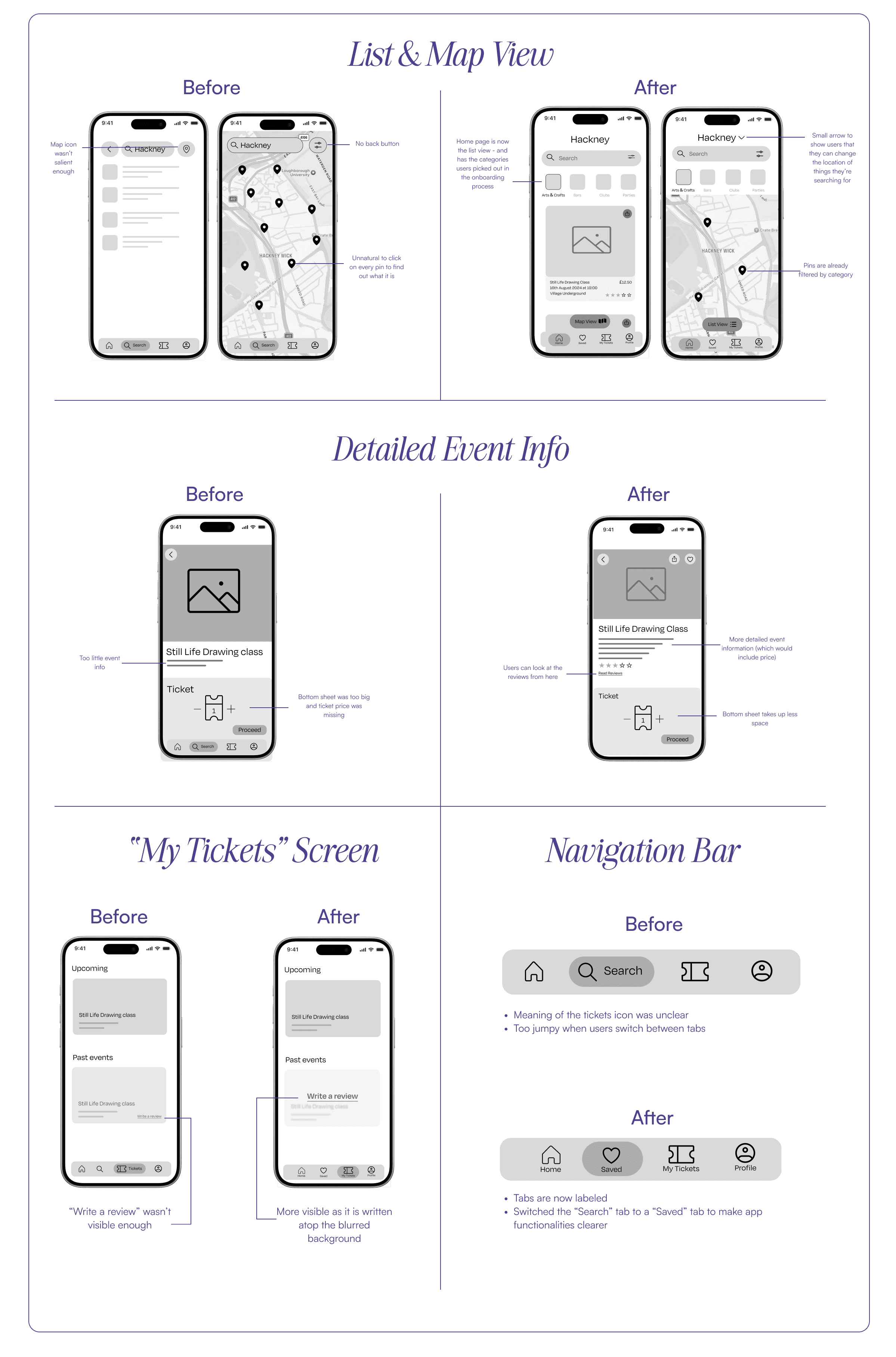
After creating my sketches, I converted them to wireframes and then conducted two rounds of user testing with 5 users each round. Each time I made the recommended changes in order to improve my design. View my final prototype here.
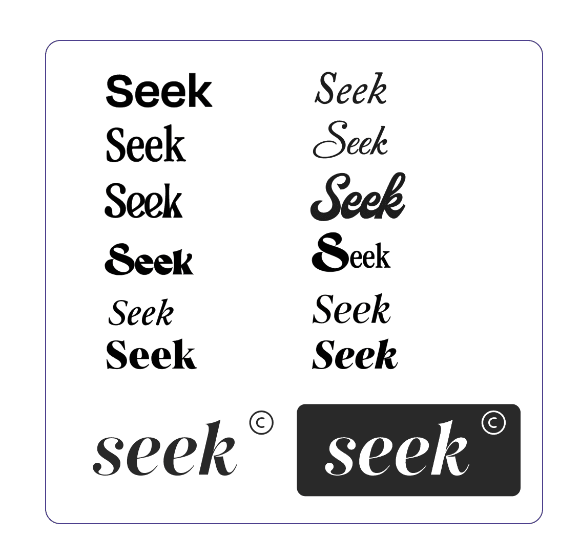
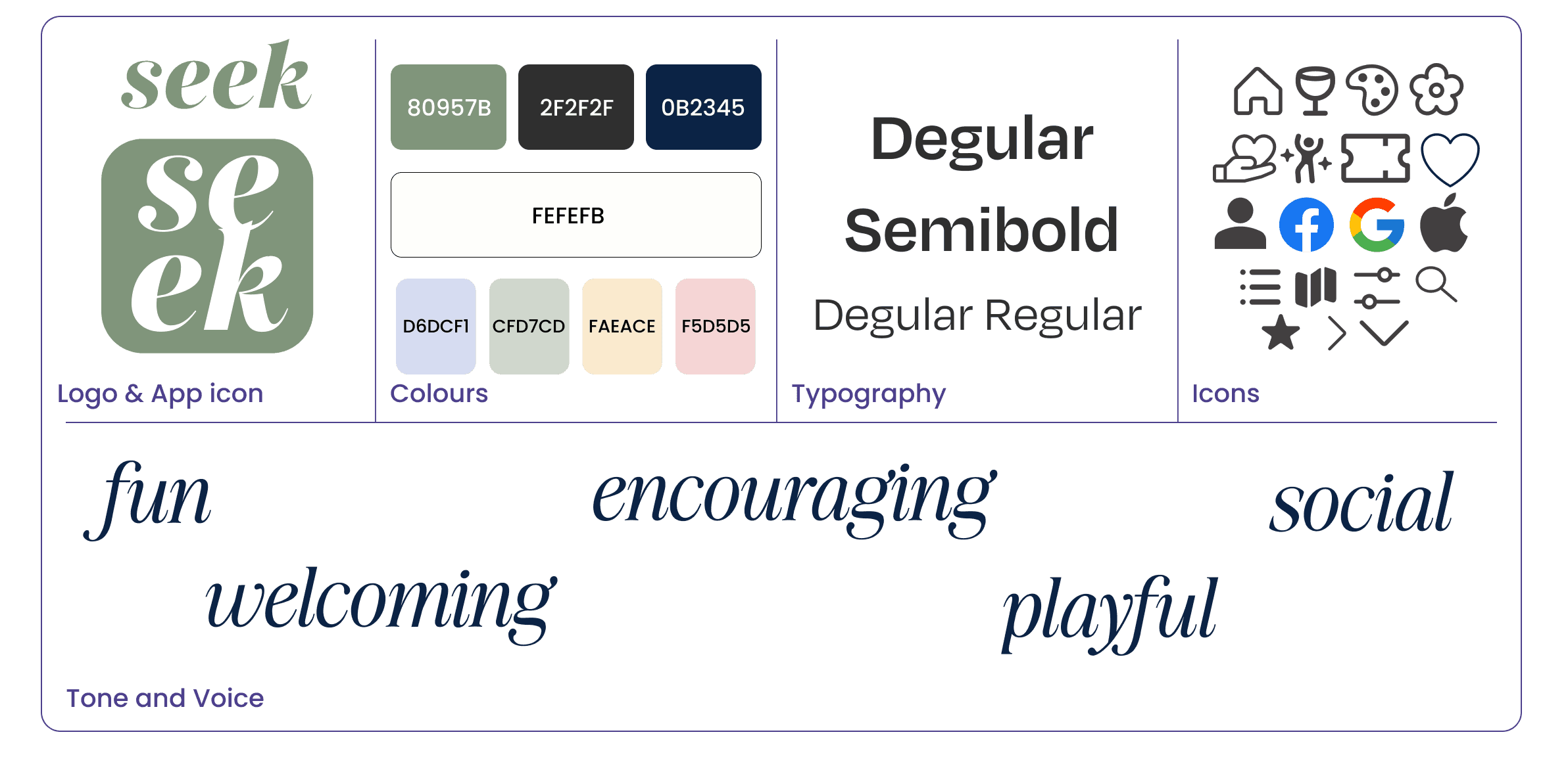
My aim was to craft an inviting brand with a playful feel.
Branding
Final Visual Identity
UI Library
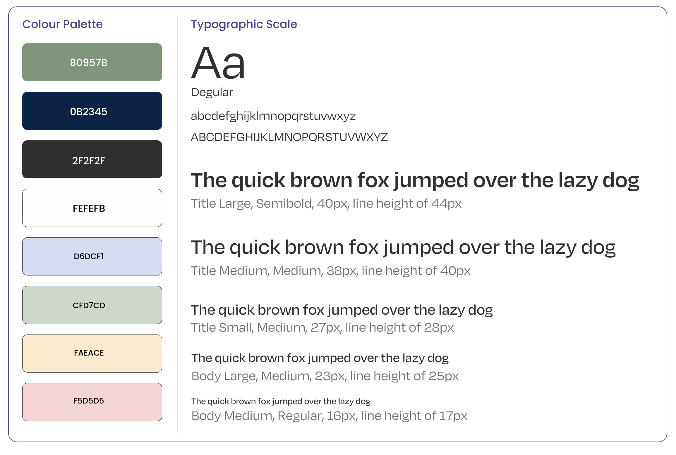
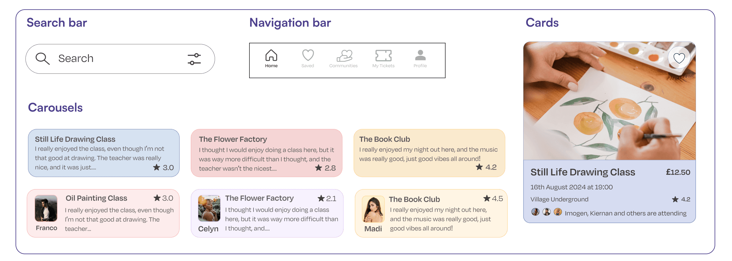
After crafting my app’s visual identity, I decided to create a user interface library. This contains all of the user interface elements used in my digital product.
A UI library helps catalogue and organise all design elements used in your design, including colours, typographic sizes, styles, weights, buttons, components, controls, and design elements.
This was done to ensure that if needed, other developers and UX/UI designers could use it.
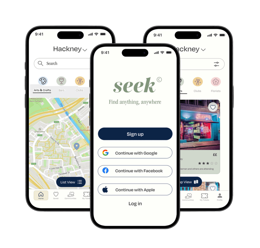
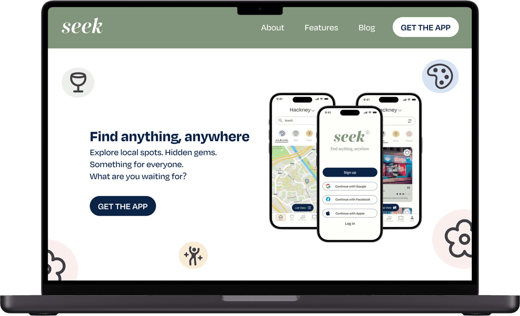
High Fidelity Screens for the mobile app, as well as a marketing website.
High Fidelity
Prototypes
Key Takeaways
& Next steps
Seek has so much potential, and I would love to make it a reality!
I’ve really enjoyed creating “seek” because it allowed my ideas to flow at every step of the process. And, it would be something I would love to develop into a real app one day.
The extensive research that I did with user interviews and usability tests, really helped me empathise with my user and identify the points of opportunity. I then learned how to design with my user in mind to make sure I meet all of their needs and goals.
More Case Studies:

