You don't have to struggle with your mental health alone. Patients First is here for you.
Independent
Myself
UX Designer
Figma
DURATION
3 weeks
DATE
May 2024
Patients First is a hypothetical government led initiative that aims to place people and patients at the centre of healthcare. This would be done by more deeply understanding patient needs and experiences, while improving patient outcomes.
The healthcare system in the UK has suffered due to the effects of the COVID-19 Pandemic. Especially in mental health services, the backlog of patients has put an unparalleled strain on the staff.
In addition to staff shortages, it has become increasingly harder for patients to receive care. In particular, patients who have been diagnosed and haven’t been are struggling to receive proper care, as waiting lists are so long.
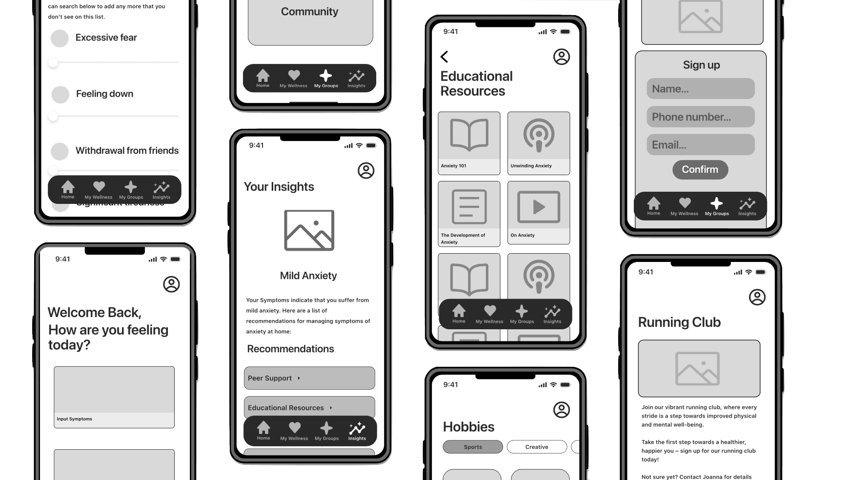
The solution I created is an app that allows users to input their symptoms to receive an informal diagnosis, and recommendations for how to alleviate their symptoms.
Additionally, the app also allows for users to connect with others who are facing similar issues, in the form of hobbies and activities - to provide a sense of community.
Background
Before starting this project, I had to find out just how bad the current
state is…
I did a lot of background research about attitudes towards mental health issues, mental health treatment, and what treatment is like. I found out a lot of shocking truths, but the ones that stood out to me were:
98% of people agree that mentally ill people experience stigma and discrimination
71% of people would not tell their employer if they had a mental health condition
61% of UK citizens with mental health issues have no access to treatment at all
These findings have highlighted to me that people are suffering, but are also struggling to ask for help, and when they do, they're not being treated.
User Interviews
What about some first-hand experience?
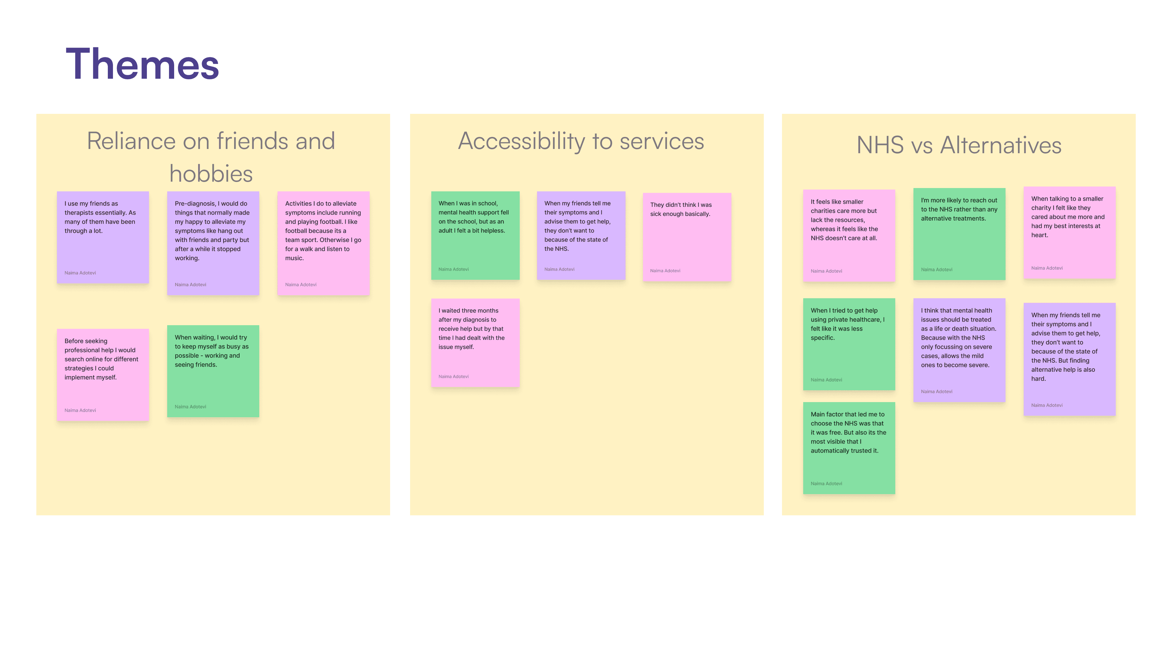
I conducted three user interviews, to gain a deeper understanding of people's experiences and how they alleviate symptoms on their own. I then developed an Affinity map to determine the key themes, as well as pinpoint behaviours, motivations and challenges.
Recruitment criteria:
Participants should be living in the UK
Having been diagnosed by the NHS or are on the waitlist to be diagnosed
Have not received treatment yet or are still waiting for treatment
Aged 18+
Key Themes
Overall, people are struggling in silence and feel demotivated by the lack
of resources available.
The affinity mapping process helped me identify 3 key themes:
HMW Question
How might we?
How might we alleviate the stress and uncertainty experienced by patients waiting for mental health treatment, while also providing educational resources to empower them with alternative coping strategies?
Persona
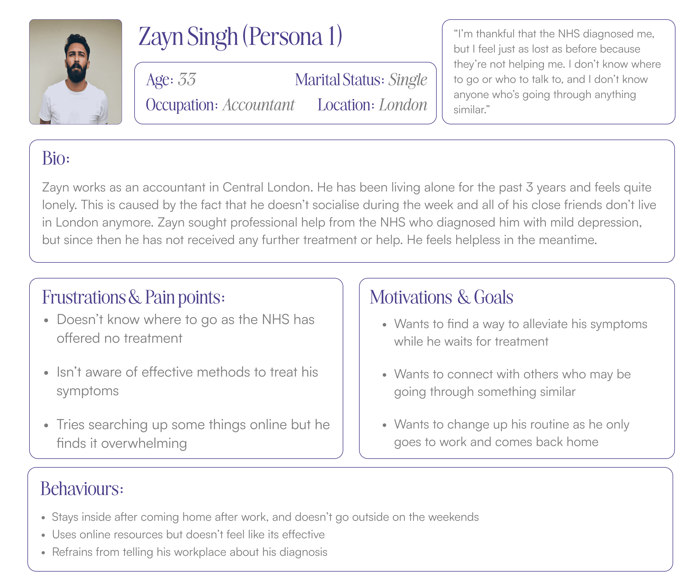
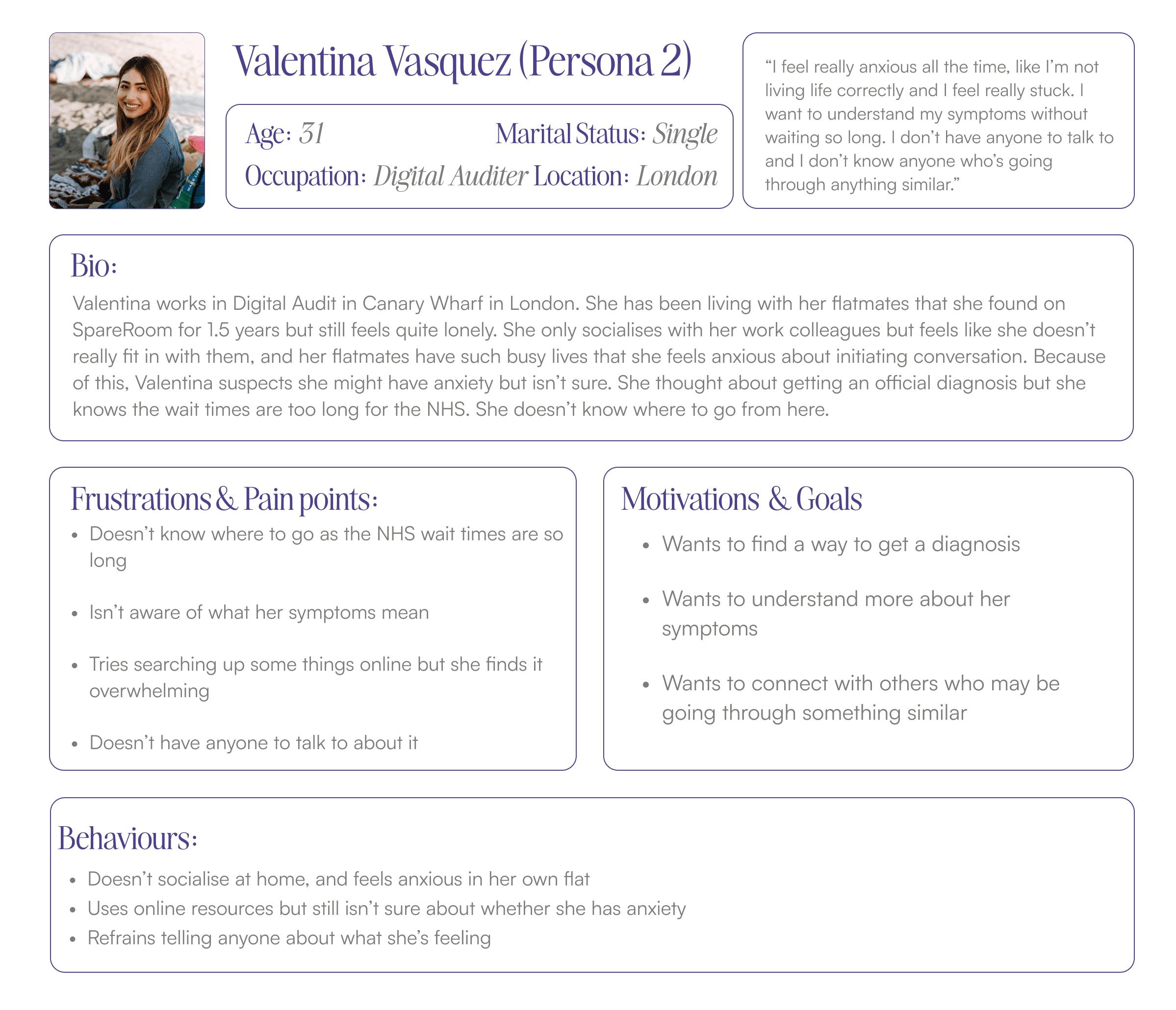
Who is my user(s)?
After reviewing my insights and my HMW question, I decided that I needed two personas - one that represented a diagnosed patient, and one that represented and undiagnosed patient.
Ideation
How do I encourage users to stay motivated to seek help, and provide some
actual relief?
Before ideating, I authored a set of user stories for both of my personas, split them into epics, and then chose two epics to focus on. These were:
Education and Personal Improvements
Connecting with others
Task Selection
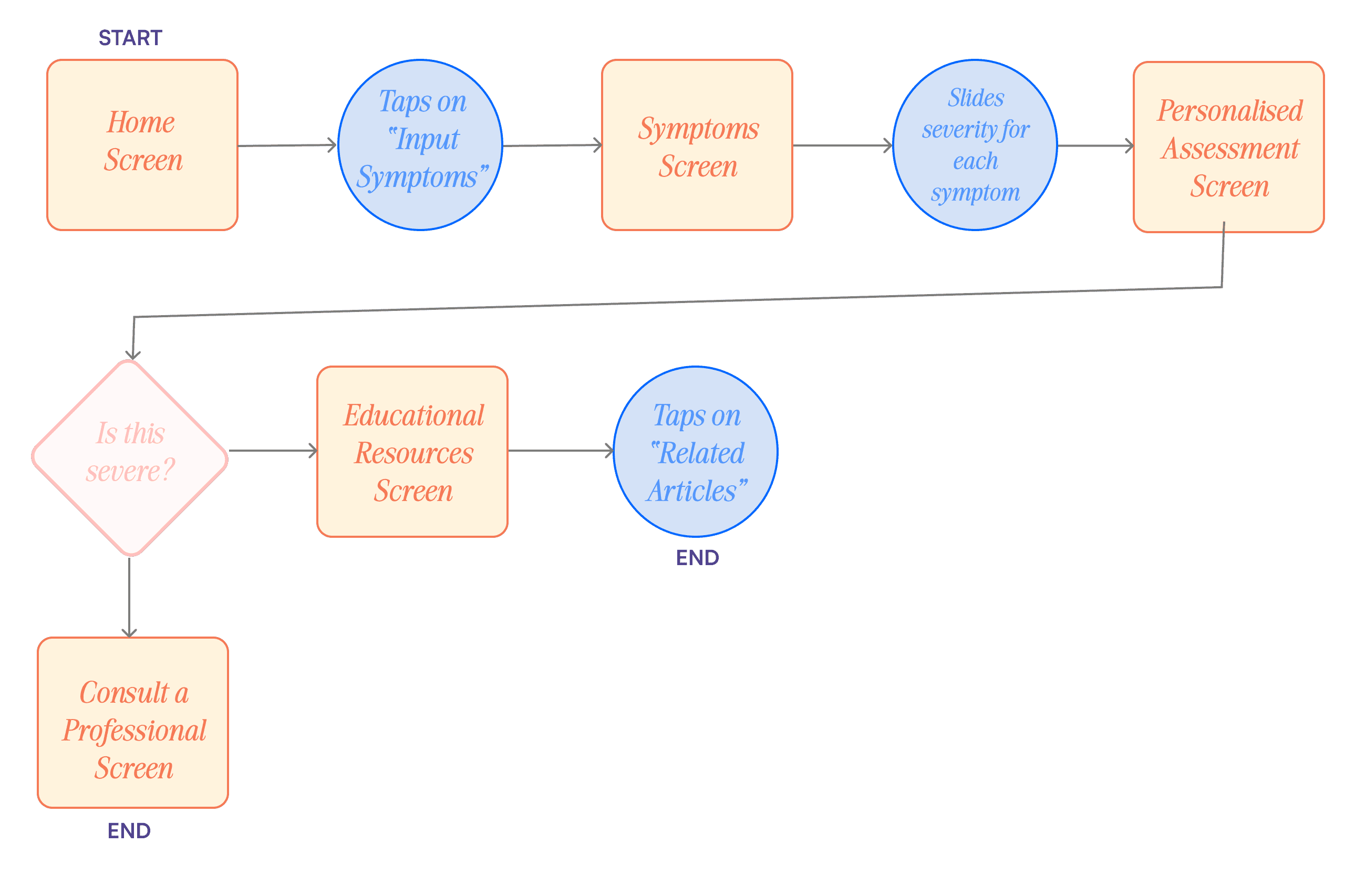
After reviewing the User Stories and Epics, I decided to focus on User 2 (Undiagnosed patient) when creating my task flow. The task I decided to focus on is inputting symptoms, which is reflected in the chosen epic: education & personal improvement.
Secondary Task Flow
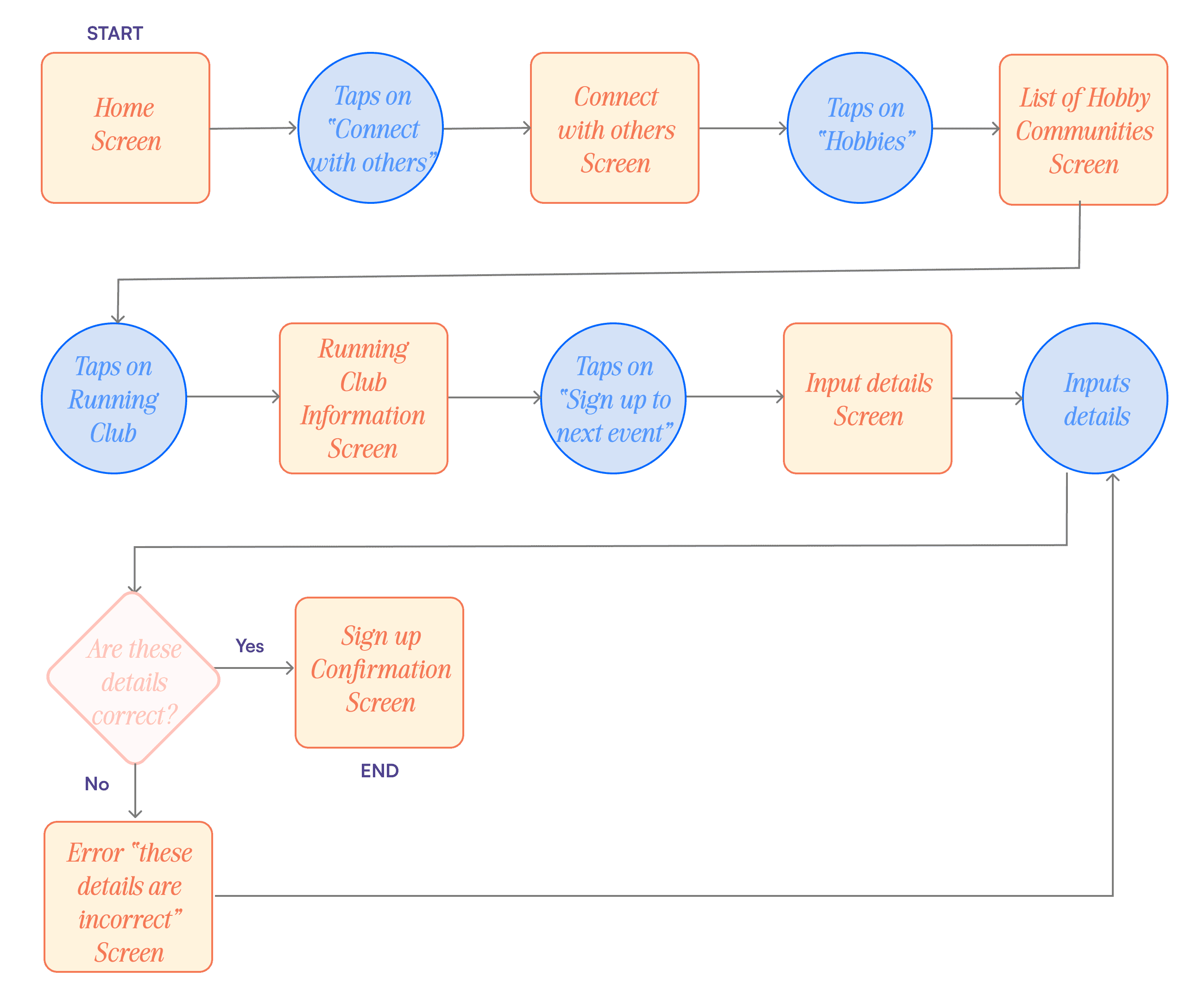
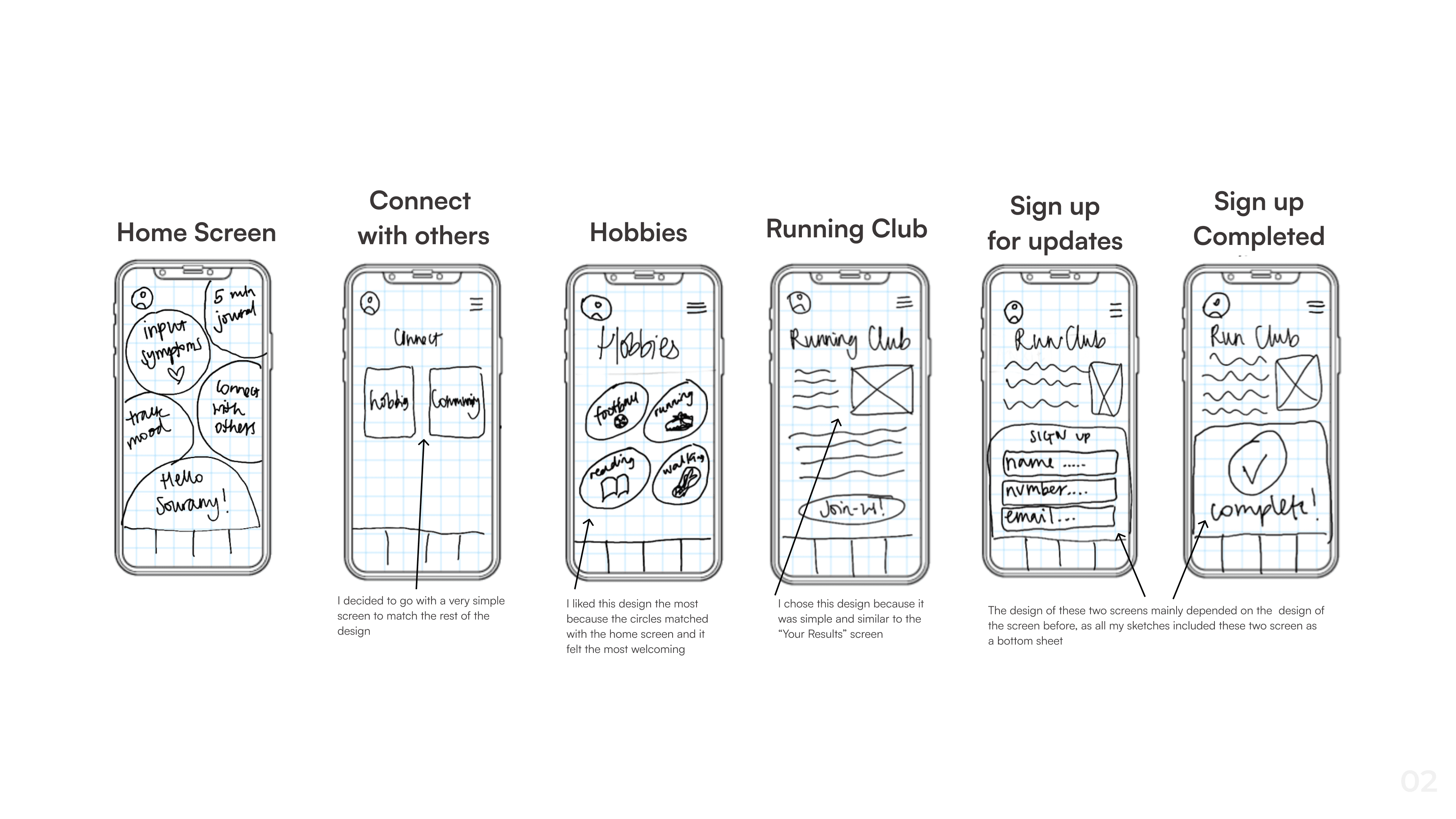
I also decided to create a secondary task flow, to show an additional task which relates to the primary task flow but reflects the other chosen epic: connecting to others.
This task flow begins on the Personalised Assessment Screen.
Develop
Nothing happens before sketching!
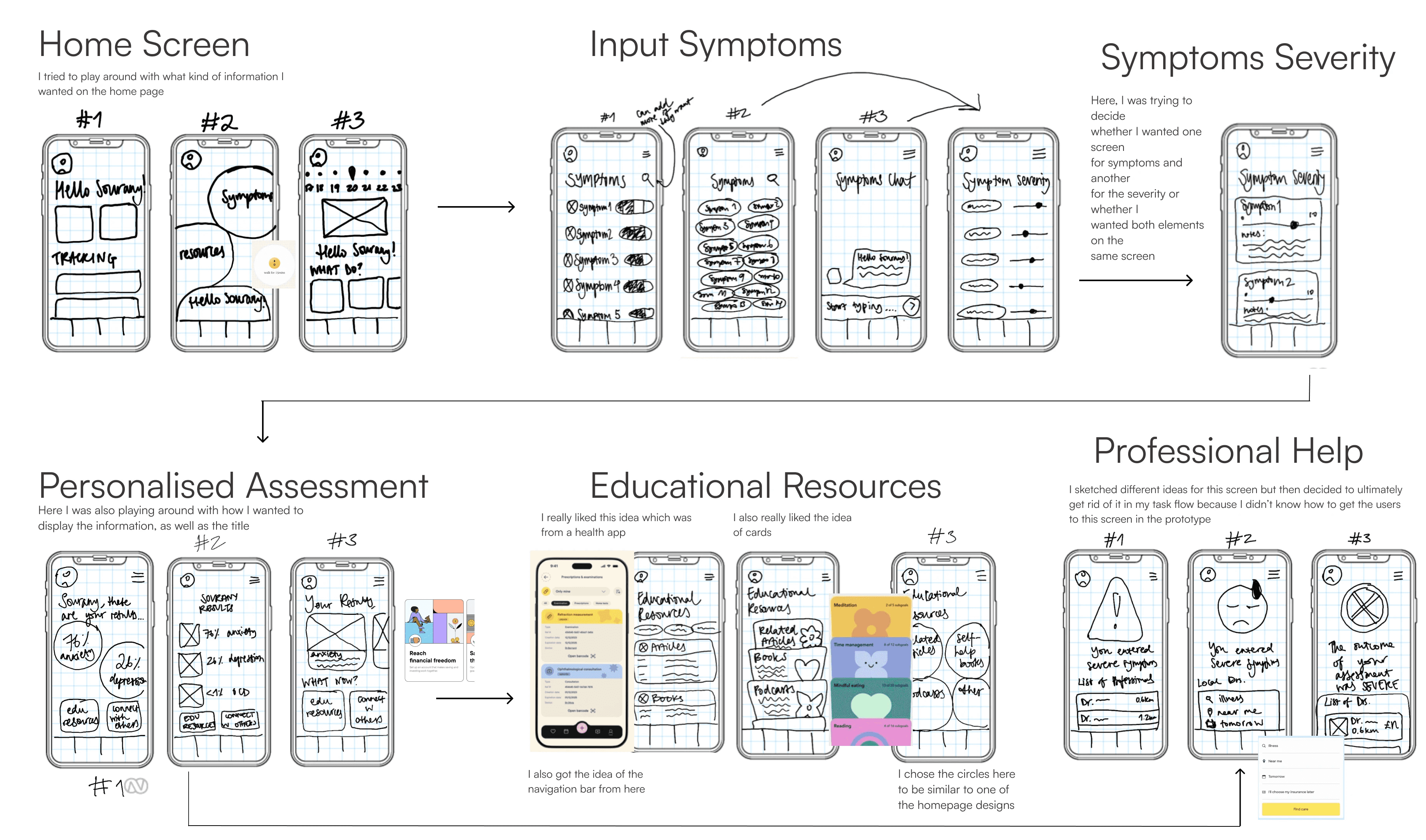
Well that's actually not true, nothing happens before a UI inspiration board! I looked for inspiration for specific elements and screens that I knew I wanted in my wireframes. These included a home page, a symptoms screen, sliders and cards.
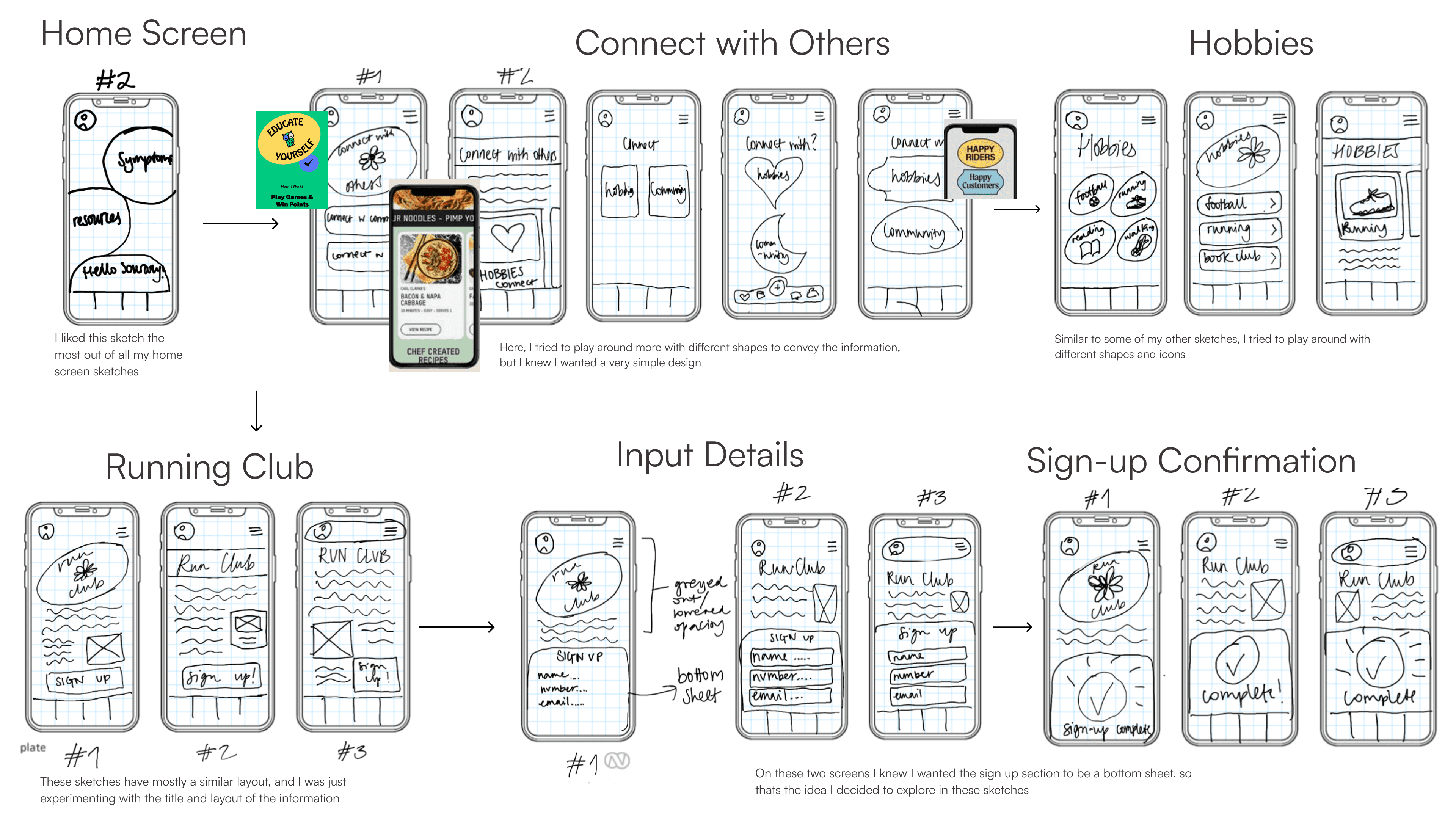
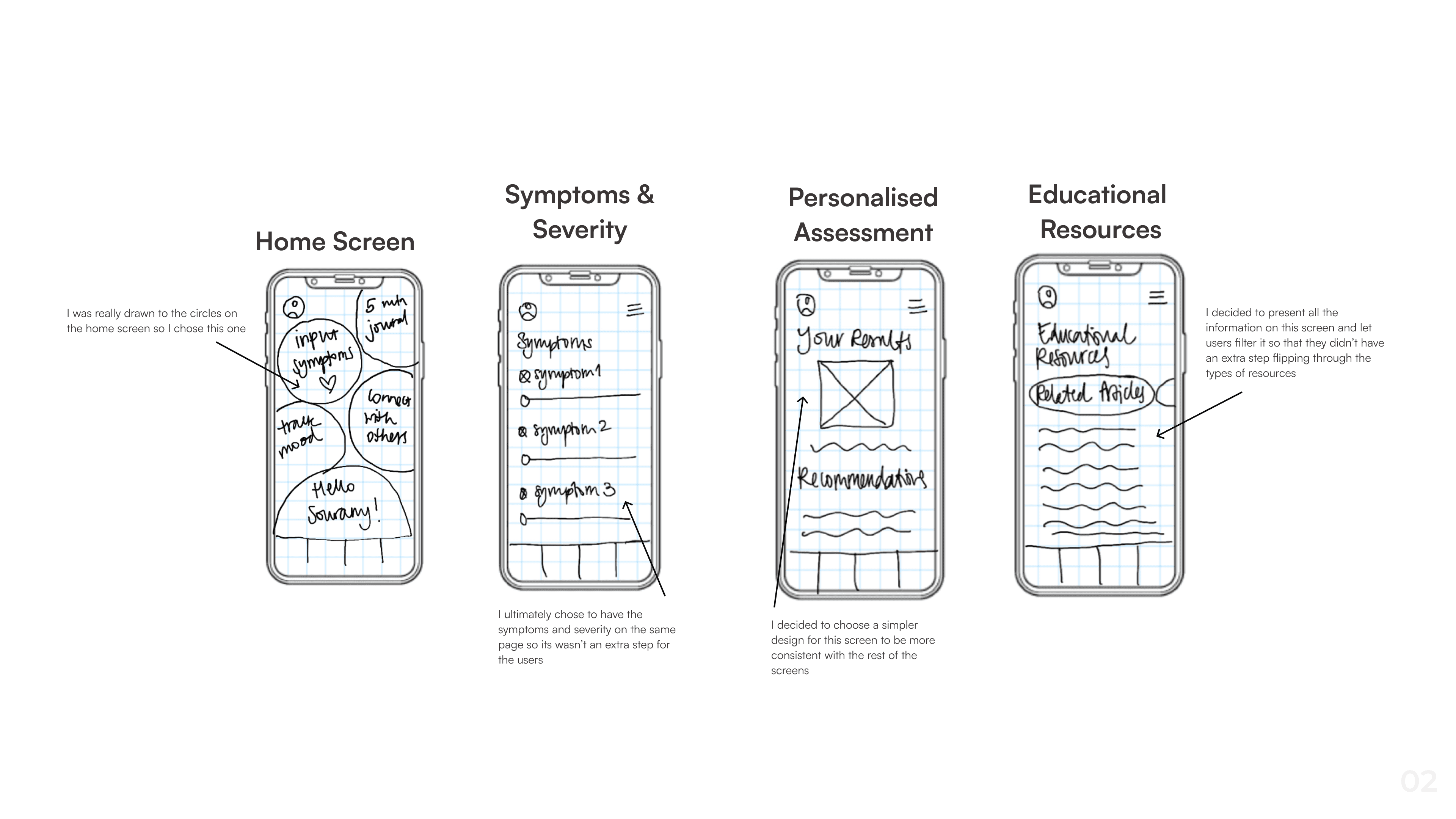
After this, I began with my exploratory sketches. I made multiples for each screen to help me visualise.
Solution Sketches
Finally, I chose the screens that I liked the best - some as they were and some combining elements of all three - to make my solution sketches that I created into wireframes.
Usability Testing
I tested the wireframes on 5 users to receive feedback on how I could improve
the design. Here's what they said…
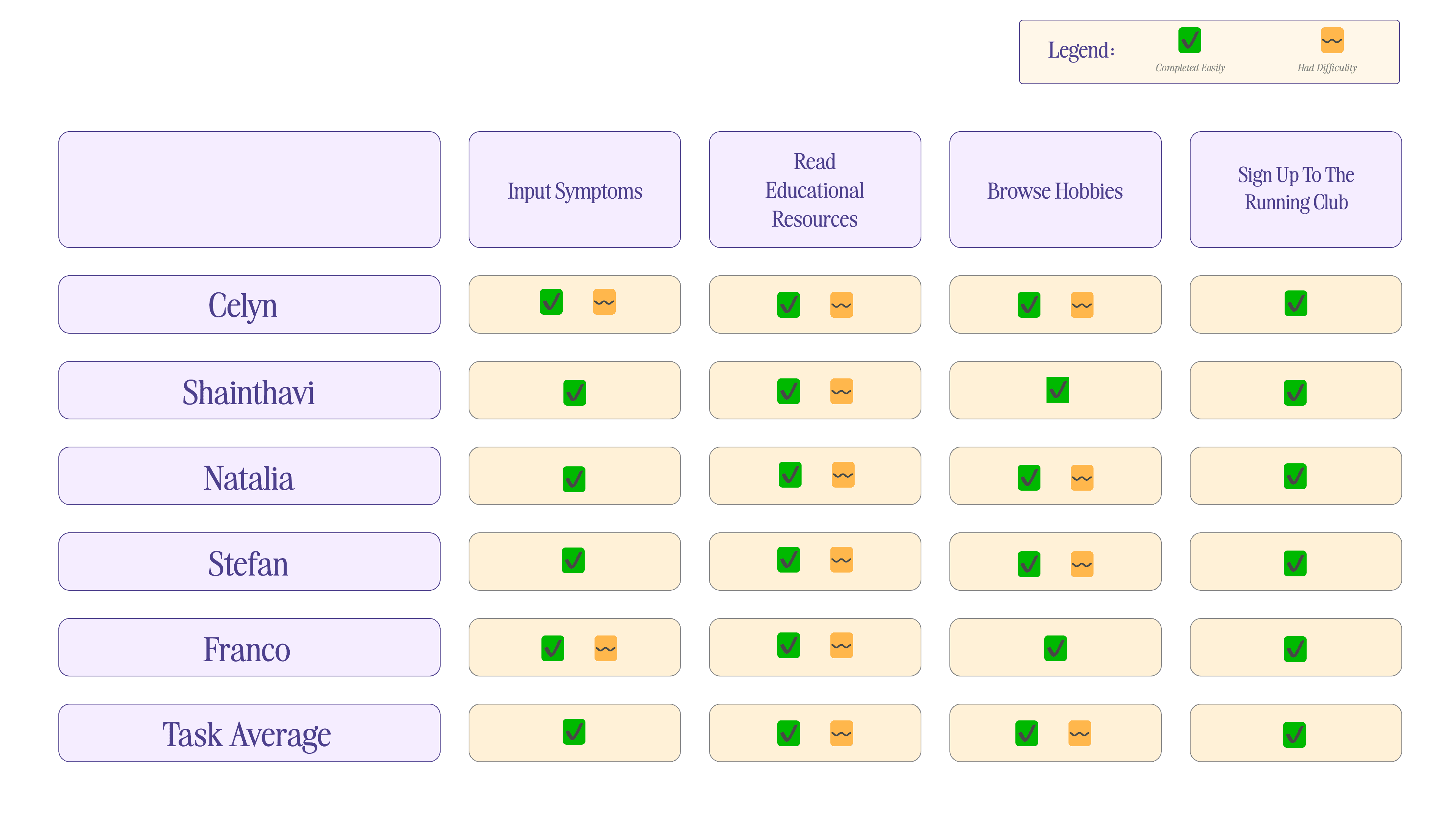
The participants were given two tasks to do:
input their symptoms and then read and browse the educational resources given
connect with others and join a running club
User Test Summary
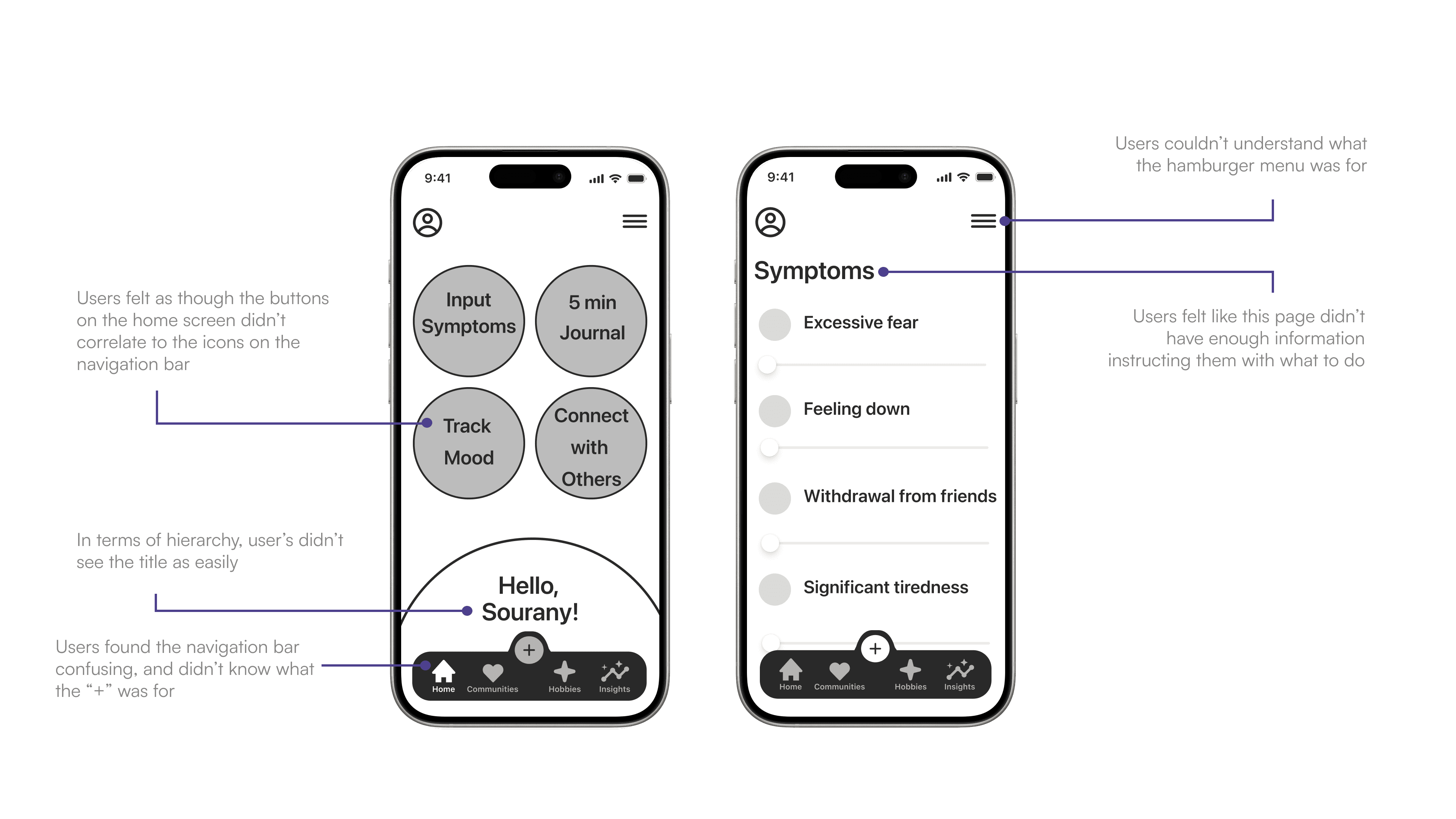
Main Issues
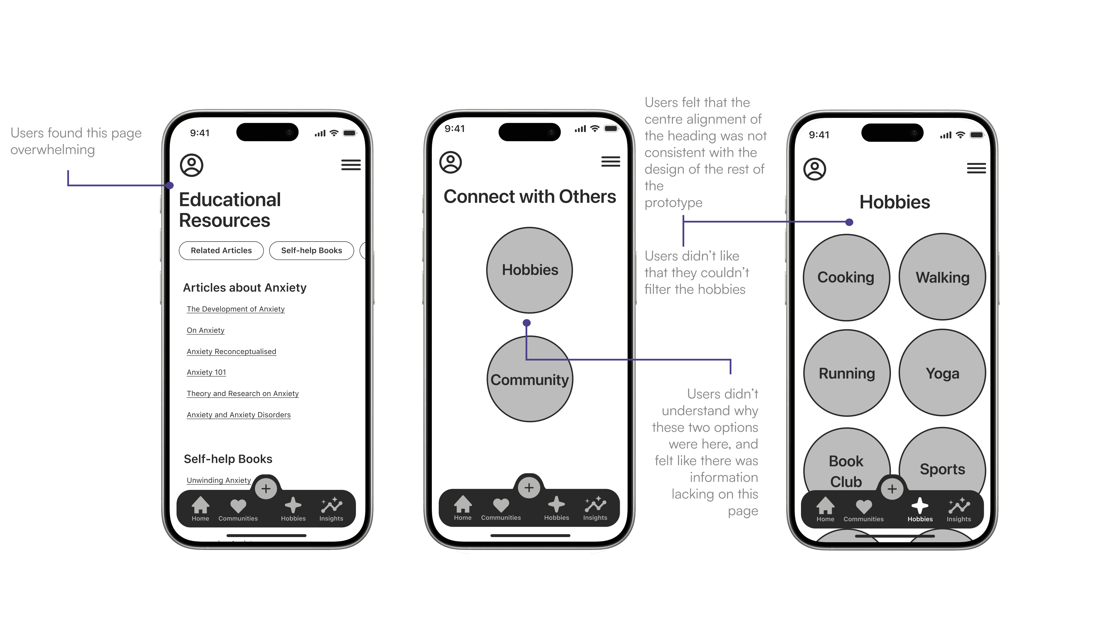
Common feedback I got from the users was about the “+” icon on the navigation bar. This confused users because it was present during their whole task flow and were confused as to why they were seeing it throughout.
Another main issue was the “Educational Resources” page, as although users liked the filter on the page, the way the information was presented was very confusing and difficult to read.
Things that went well
Regardless of the main issues, users really liked the simplicity of the design of the prototype, and found the buttons etc. on the screens easy to navigate.
I think this is why the users were all able to complete the tasks, however there still was some difficulty.
Overall Testing Results
Overall Task Analysis - What went wrong?
Mid Fidelity
Prototype
Taking onboard the feedback I was given…
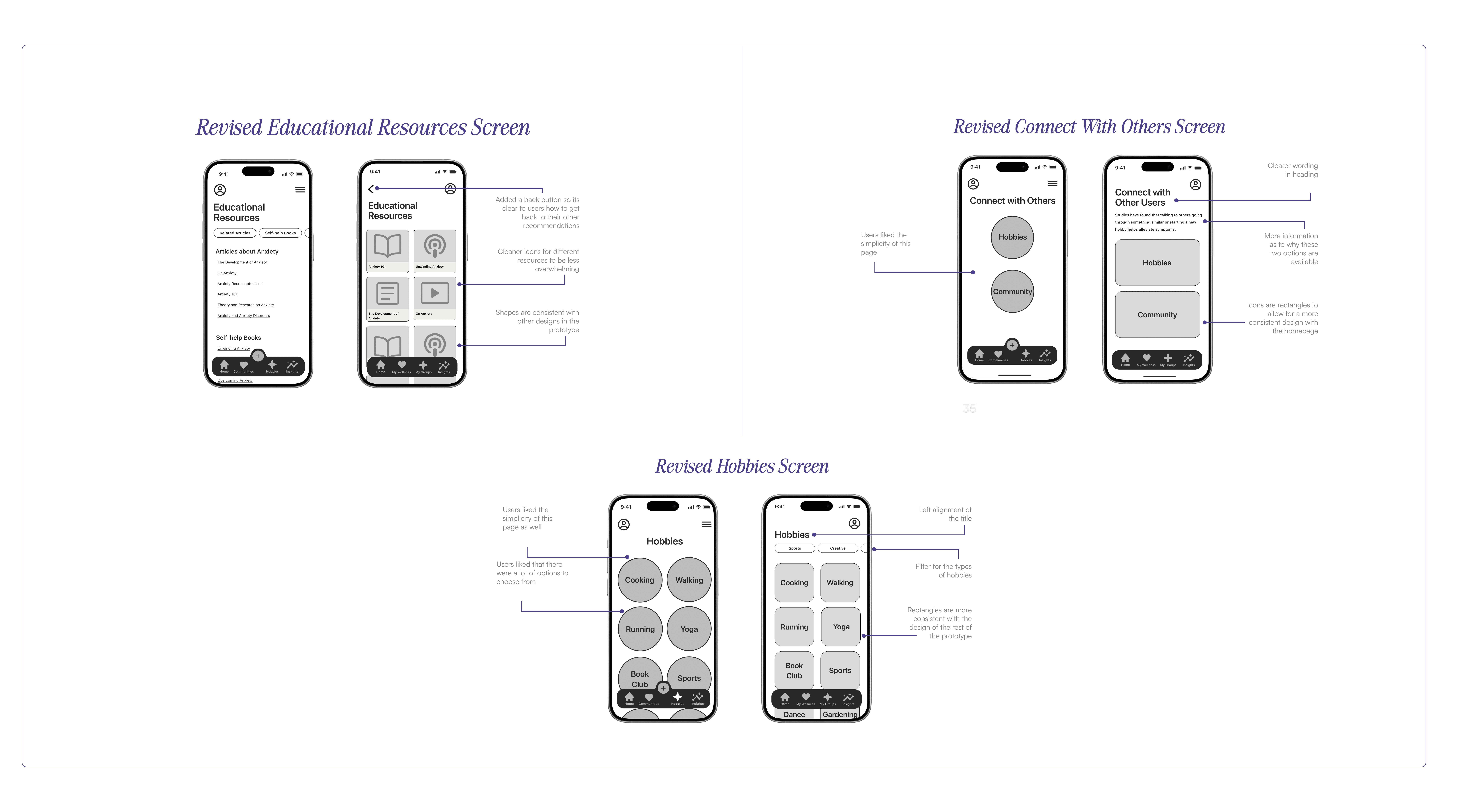
After my usability tests, I made a design prioritisation matrix to keep track of the changes I needed to make. I then made the revisions to each of my screens to create the final version of my wireframes.
Key Learnings &
Next Steps
This project was fun! but a lot of work.
I’ve really enjoyed creating this app for Patients First, as it was my first time actually doing the design process. I found getting the insights from the user testing really interesting, as you never know what feedback you'll get, and what's clear to you isn't necessarily clear to the user.
I could take this project further in the future and create high fidelity wireframes and develop the visual identity more as this is a solution for a real worldwide problem.
More Case Studies:

